
Xiaomi’s new ‘squircle’ logo becomes the butt of online jokes with many claiming they could have made it for much less money
Xiaomi
Chinese smartphone maker Xiaomi is being mocked on social media for spending three years and hundreds of thousands of dollars on a revamped logo that looks remarkably similar to the original, which the company had been using since its founding in 2010.
The unveiling happened on Tuesday (March 30) during what Xiaomi dubbed its Mega Launch event, where it confirmed a long-rumoured plan to make electric vehicles and launched a foldable smartphone.
The logo – which now takes the shape of a “squircle”, swapping out sharp corners for rounded ones – represents a new image for the company, founder and CEO Lei Jun said during the event.
Lei confirmed that the company started its search for a new design in 2017, ultimately enlisting the help of renowned designer Kenya Hara, the art director of Japanese retailer Muji.
“Finally, a design moved us,” Lei said. One widely reported figure in China put the cost of the logo at 2 million yuan (S$410,000), a number Xiaomi has not confirmed but a detail that netizens quickly latched onto.
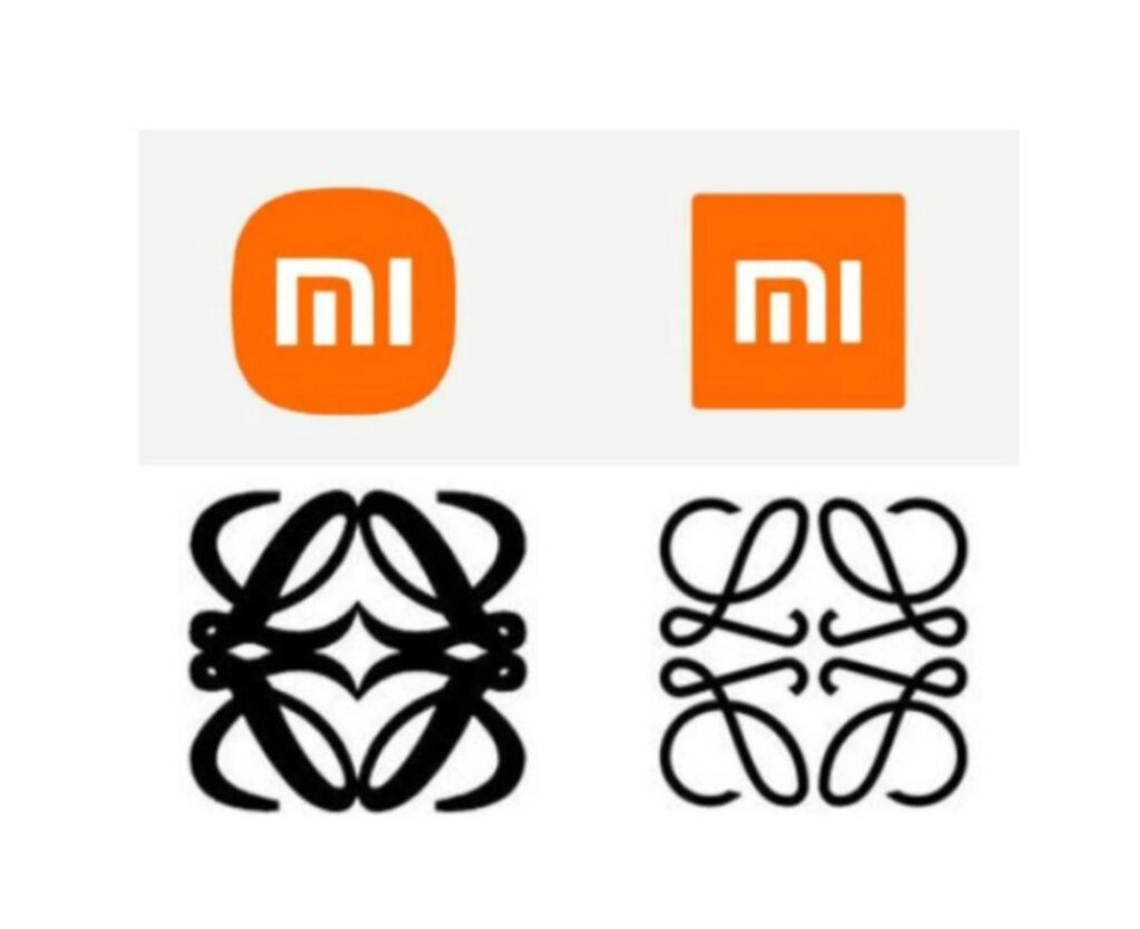
PHOTO: Weibo and Xiaomi
“I think Boss Lei got scammed,” one Weibo user commented under Xiaomi’s post about the new logo, drawing more than 4,000 likes. “I suggest that Xiaomi call the police.”
“I can do this for 20,000 yuan,” another Weibo user wrote. “Or 2,000.”
Xiaomi declined to comment.
Xiaomi was China’s largest smartphone maker both at home and abroad in the fourth quarter, surpassing Huawei Technologies Co domestically after US sanctions on the telecoms equipment giant started to take a toll . It is a return to the top for the smartphone brand after it was overtaken in 2016 in China by local competitors Huawei, Oppo and Vivo.
However, being back on top has not brought Xiaomi the kind of adoration that competitor Huawei saw from heightened patriotic sentiment in recent years resulting from the US-China tech war .
Lei acknowledged at the event that people might find the new logo underwhelming. “Are you disappointed at this logo, that we just made our original logo rounder?” he asked the audience.
Lei followed up with an article on his official WeChat account. “I suppose many people would say, ‘That’s it? That took three years?’” he wrote. Many reactions online are asking exactly that, but Lei said the change represents an upgrade of the company’s “internal spirit and qualities”.
Hara’s own explanation for the design suggests more work went into it than simply rounding the edges.
In a five-minute pre-recorded video played at the event, Hara said he sought the best shape combining a circle and square by extensively studying both shapes and applying mathematical equations.
The result, according to the designer, strikes a perfect balance between the two. In addition to changing the shape of the orange background, Hara adjusted the curves of the typography for the “mi” letters so that they match the rest of the design.
Lei said that he was moved by Hara’s suggestion that the new logo incorporated “thinking from Eastern philosophy”.
Some people responded to this line of thinking online, saying the story behind the new logo is more important than the actual changes. Others said that the cost of hiring Hara was money well spent – not for the design itself but for all the attention it is bringing to Xiaomi through viral discussions online.
In response to a post on question-and-answer site Zhihu asking for thoughts on the new design, one person responded, “You think Lei was duped by a Japanese master, while in fact he took advantage of all the traffic on the internet.”


Comment (1)
Have you ever thought about including somewhat bit extra than just your ideas? I imply, what you say is important and everything. However its obtained no punch, no pop! Maybe if you added a pic or two, a video? You could possibly have such a extra highly effective weblog for those who let people SEE what youre speaking about as a substitute of just studying it. Anyway, in my language, there usually are not much good supply like this.