
8 Killer Tips for a Stunning PowerPoint Presentation Slides
A good presentation certainly depends a lot on the presentation skills of the speaker, however, the tools that we use to deliver the presentation shouldn’t be overlooked as it plays an important role to keep the audience engaged and focus on you.

A great PowerPoint presentation should be thoroughly researched and well planned for the easy delivery of accurate messages to the audience. In addition, the slides should be well designed and visually comfortable to the audience for the best results.
As a speaker, multiple rehearsals are a must in order to minimize mistakes and to have better confidence to present in a relaxed and confident outward projection.
So what are the tips for better PowerPoint Slides?
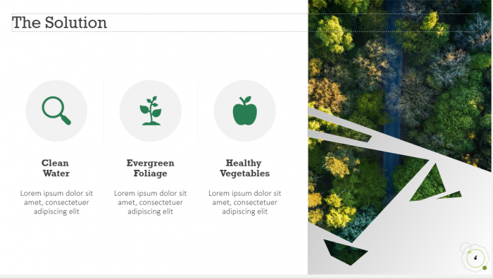
1. Keep It Simple
This is the first and most powerful rule to follow in every PowerPoint presentation- keep it simple yet attractive. Leonardo Da Vinci once said, “simplicity is the ultimate sophistication.” A cluttered slide with words and pictures is not going to be a great view for your audience.
Besides, most of the time they are confused with whether they should pay attention to the speaker or continue reading the slides. Thus, keep the words in your slides short and simple. You do not need to capitalize every word in your bullet point or bold it. The simpler the better.
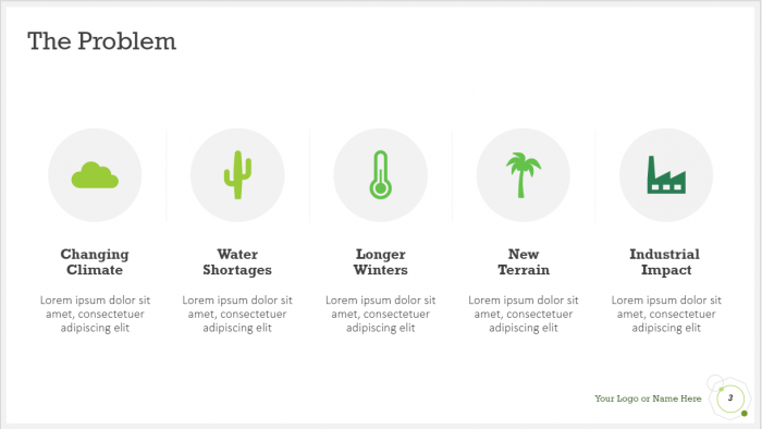
Here is an example of a simple slide:
2. Utilize High-Quality Photos
High-quality photos are essential if you want to make your slides visually appealing. Remember to use photos that are clear and do not adjust the width or height of the photos alone, try to enlarge it instead. If the photo is a blur after enlargement, you should select another photo.
Humans are naturally more attracted to images and colours, and your audience will view the PowerPoint as more impressive with good quality photos.
3. Use Fresh Templates/Create Your Own Template
Everyone has definitely used the basic PowerPoint template before as a rookie. And admit it, we are not captivated by it anymore and we can immediately recognize the template the moment it appears in the presentation screen.
We do not want our slides to look at old school and outdated with our brand-new presentation. Try to download fresh templates online or create your own template.
It can be simple and basic as long as it hits serves its purpose as a great slide.
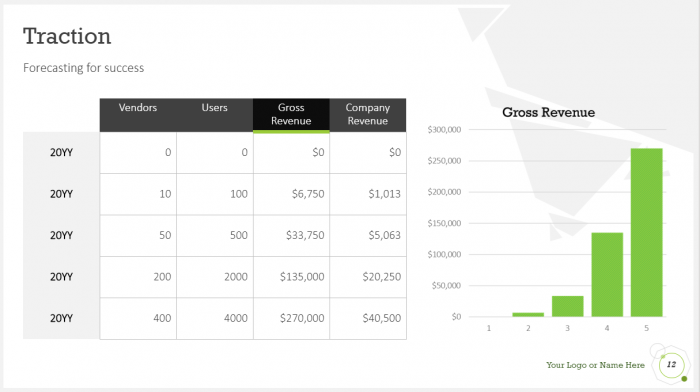
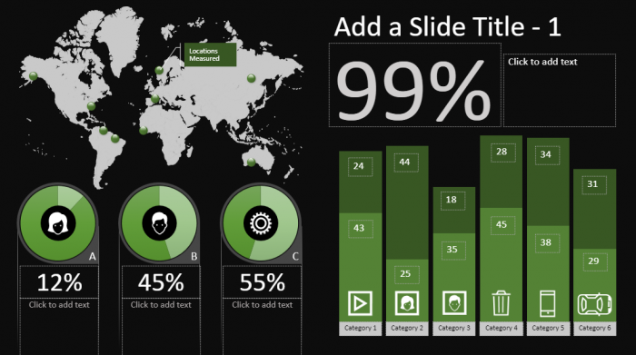
4. Skip the Bullets – Utilize Charts and Graphs
Charts and graphs are perfect tools to bring the message to the audience in the clearest way. Avoid using bullet points if possible. Make the numbers and percentage meaningful using a pie chart or walk through the process with your audience with a flow chart.
Behold, the charts and graphs should be simple and clean. We do not want our audience to spend 10 minutes to decipher what is the X-axis representing.
5. Choose Appropriate Fonts, Colours
In truth, typography plays a much more important role than we assume it to be in our slides as it has a subconscious effect for the audience to determine the quality of our presentation.
Do not use excessive colours in words that make it look like a vibrant, colourful work of an artist. To engage the audience, choose the font style and colours that are professional.
6. Aligned Your Points
It helps to instil a sense of visual rhythm to your PowerPoint presentation. Aligned your points and images to the side or centre as deemed appropriate to make it looked polished, professional, and perfect.
7. Use Icons and Videos
It is time to drop the readymade clip art in the PowerPoint. There are many free professional icons and graphic online that can be used for a professional presentation.
Insert videos in between of your slides to share your perspective in a different angle and it allows your audience to keep their focus. Besides, you can have a short break too!
8. Drop the Flashy Slide Transitions and Sound Effects
Flashy slides transitions and sound effects (the “swoo-oosh” sound) is distracting and outdated. It is okay to include some transitions and subtle animations but keep in mind to use it at the appropriate time and make sure it resonates with your audience.

Final Thoughts
Our main goal is not to get the audience to remember our slides.
It is to utilize the slides to support your message and implant it to the audience mind with ease. If you put the effort in designing your slides, the effort would not go wasted even if the presentation went sideways.
Think of the slides as a test of basic marketing skills- the way to you create your slides showcase your design skills, technical literacy, and credibility with a sense of personal style as a professional and speaker.


Comments (2)
Thanks for your marvelous posting! I quite
enjoyed reading it, you may be a great author.
I will always bookmark your blog and may come back in the future.
I want to encourage you continue your great work,
have a nice evening!
Keep on working, great job!